Search the site by keyword

Part 3 | Productivity trends

The opportunities that come with advances in science, technology, transport, and innovation are huge and so our options to grow the value of our assets and business go well beyond the traditional focus.

David Tapsell | Pukeroa Oruawhata Trust


This chapter considers Aotearoa New Zealand’s productivity performance over time and compares it with other advanced economies. Our analysis is primarily based on two sources: Stats NZ’s most recent productivity statistics (1978–2022) and international data compiled by the OECD.


3.1 Aotearoa New Zealand’s productivity has been low for many decades

Aotearoa New Zealand’s workers have been producing less for every hour worked than those in other OECD countries for half a century (Figure 3.1). In 1970, New Zealand’s GDP per hour worked was only marginally below the OECD average – comparable with the average of other early OECD members, but below that of comparator countries such as Sweden and Canada. In the first half of the 1970s, New Zealand’s productivity dropped behind that of its peers, particularly after the Oil Shock of 1972. This marked the beginning of a long period of relative decline, with productivity levels continuing to diverge through to the mid-2000s.

Figure 3.1 Aotearoa New Zealand’s productivity has lagged behind other developed countries
GDP per hour worked, 1970–2020

Figure 3.1 Aotearoa New Zealands productivity has lagged behind other developed countries

Source: New Zealand Productivity Commission calculations, based on OECD Productivity Database.

Notes: Early OECD countries are defined as those who joined the OECD prior to 1975. This includes Australia, Belgium, Canada, Denmark, Finland, France, Germany, Greece, Iceland, Ireland, Italy, Japan, Netherlands, New Zealand, Norway, Portugal, Spain, Sweden, Switzerland, Turkey, the UK and the US.

Aotearoa New Zealand’s relative position stabilised in the 2000s, a period in which many OECD countries were seeing a slowdown in productivity growth (Figure 3.2). This widespread slowdown preceded the GFC in many cases and has continued into the 2010s. Several possible explanations for the recent global slowdown have been suggested. Changes in industry composition (such as decline in manufacturing) in many developed countries have contributed to a reduction in the relative size of the tradeable part of their economies. Industry composition in developed countries has instead shifted towards the services sectors, where measurement of productivity is more difficult (Pells, 2018). As noted in section 2.3 above, Baumol’s cost disease may affect these industries, because they are poorly suited to standardisation and (by implication) to substitution by technology, and because their quality depends (or is thought to depend) on the amount of human labour they involve (Baumol, 1996).

Some have argued the supply of economically transformational ideas has simply dried up or at least currently slowed down (Bloom et al., 2020; Gordon, 2018). Others have a more optimistic view that the slowdown is temporary, as firms better understand and implement new technologies, such as machine learning and artificial intelligence (Brynjolfsson et al., 2021). The impacts of major, pervasive technological change – or “general purpose technologies” also take time to manifest, because they come from complementary investments such as adjusting production techniques (ibid). Another explanation for the global slowdown is that the benefits of newer technology are not being spread or shared as widely as in the past, leading to an increasing productivity gap between the leading firms and the rest (Akcigit & Ates, 2019, 2021; Andrews & Criscuolo, 2019). Finally, the global productivity slowdown has been attributed to an increased propensity to save and decreased propensity to invest, leading to excess savings and downward pressure on demand, interest rates, and growth (Summers, 2016).16

Figure 3.2 Productivity growth globally has slowed since the 1970s
Growth in GDP per hour worked, by decade, 1970–2019


Figure 3.2 Productivity growth globally has slowed since the 1970s

Source: New Zealand Productivity Commission calculations, based on OECD data.

Notes:  Growth rates are annualised average growth calculated from USD, constant prices, 2015 PPPs.

3.2 Aotearoa New Zealand’s productivity over the longer term

Looking back in history, the numbers have not always been so bleak. According to estimates of GDP by Angus Maddison and others (Bolt & Van Zanden, 2020), Aotearoa New Zealand was one of the most productive economies in the world (alongside Australia, the UK and the US) at the end of the 19th century (Figure 3.3). As McCann (2009) noted, this equalisation is exactly what economic theory suggests would occur with such a “highly integrated set of bilateral trade, capital mobility and labour mobility relations” between the UK and New Zealand, Canada and Australia.17

Globally, there has been massive growth in productivity (as measured by output per person)18 since the 19th century. This has meant huge advances in life expectancy and poverty reduction. This growth built on, and has enabled, significant investment in productivity-enhancing factors like education, research, physical capital and infrastructure, technology, and knowledge.

In 1870, Aotearoa New Zealand was one of the leaders in terms of per capita output, and this continued until the Second World War (a period when the US was emerging as the global economic leader, to replace the UK). As the world rebuilt after the Second World War, older capital and infrastructure was replaced with newer versions, and technology developed during the war spread to civil society. This led to a post-war productivity boom in many economies. Although New Zealand stayed with the pack initially, GDP per capita largely stagnated between 1970 and 1990 – a period characterised by rapid growth in many other economies. This 20-year period of low growth left New Zealand towards the bottom of the list of advanced OECD countries. Since 1990, New Zealand’s growth has improved, but not enough to catch up with its peers.

Figure 3.3 Aotearoa New Zealand’s relative decline began in the mid-20th century
Real GDP per capita (20 1 USD), 1870–2018

Figure 3.3 Aotearoa New Zealands relative declinebegan in the mid 20th century

Source: New Zealand Productivity Commission calculations, based on Maddison Project Database 2020 (Bolt & Van Zanden, 2020).

3.3 The last half century

Although Aotearoa New Zealand’s growth rates of GDP per capita have been respectable over the past 20 years, this growth is more reflective of increased labour utilisation than increased labour productivity.

Compared with other early OECD members (those joining the OECD prior to 1970), the majority of Aotearoa New Zealand’s output and income growth has come from increasing the amount of labour input used, rather than the productivity with which it is employed (Figure 3.4). New Zealanders have been consistently working more hours than other OECD economies since the 1980s. This has meant that, although the productivity of New Zealand’s workers has declined relative to their peers (GDP per hour worked has dropped well below the average for early OECD member countries), the relative decline in per capita output in the 1970s and 1980s was less extreme and has reversed in the last couple of decades.

Figure 3.4 Aotearoa New Zealand’s growth has come from working more hours, rather than increased productivity
New Zealand’s performance relative to early OECD countries (Early OECD = 100)

Figure 3.4 Aotearoa New Zealands growth has come from working more hours rather than increased productivity

Source: New Zealand Productivity Commission calculations, based on OECD data.

Notes:  Figures are relative to the population weighted average of countries, which joined the OECD prior to 1975 (early OECD = 100).

Labour utilisation = hours worked per head of population.

We can separate the total hours worked by New Zealanders into two components: the number of employees and the number of hours worked by each of these employees.

Average hours per employee in Aotearoa New Zealand have remained quite stable since 1970. This trend is similar to the US (Figure 3.5). However, most early OECD comparators have seen a gradual decline in hours worked per employee, while Nordic countries like Denmark and Sweden have much lower (and falling) working hours, which may be due to a different work culture in those countries (Riekhoff et al., 2019).

Figure 3.5 New Zealanders continue to work long hours
Average hours worked per employee, 1970–2020

Figure 3.5 New Zealanders continue to work long hours

Source: New Zealand Productivity Commission calculations, based on OECD data.

Notes:  South Korea is not included in the graph; it grew rapidly and converged towards the OECD average.

Hours worked dropped rapidly, which confirms that, as they develop, economies have higher output because of higher productivity and not because of working longer hours.

Figure 3.6 Aotearoa New Zealand’s employment rate has recovered strongly since the 1990s
Employment rate (% of population), 1970–2020

Figure 3.6 Aotearoa New Zealands employment rate has recovered strongly since the 1990s

Source: New Zealand Productivity Commission calculations, based on OECD data.

Aotearoa New Zealand’s employment rate was very similar to Denmark and higher than the US and Canada, historically until the late 1980s. The employment rate then fell, as unemployment rose following the economic reforms of the 1980s. Although employment grew strongly from the mid-1990s onwards, it was not until the mid-2000s that the employment rate reached pre-reform levels. Like in many countries, New Zealand’s employment rate saw a further dip during the GFC, but it picked up strongly in the early 2010s, with rates exceeding many other OECD economies in the lead-up to the COVID-19 pandemic. Maré et al. (2017) found that average composition-adjusted skill of workers declined by 1.8% over the period 2001–2012, as growth in employment disproportionately attracted workers with lower-than-average skill levels.

It has been a different story for capital. Aotearoa New Zealand has supported its workers with a much lower level of capital than almost all OECD economies for the last half century. New Zealand’s capital stock per hour worked has remained at around half that of countries like Australia, Sweden, and the US. However, it has been dropping further behind other countries. Denmark deployed 81% more capital for every hour worked than New Zealand in 1970, but this had risen to 164% (that is, 2.5 times that of New Zealand) in 2019. South Korea’s capital per worker was a mere 15% of New Zealand’s in 1970 and, by 2019, this had risen to almost 50% higher than New Zealand’s.

Figure 3.7 Aotearoa New Zealand has long been a low-capital economy
Real capital stock per hour worked (2017, USD thousands)

Figure 3.7 Aotearoa New Zealand has long been a low capital economy

Source: Penn World Tables (PWT 10.01) (Feenstra et al., 2015).

Notes: Capital comprises nine asset types: residential buildings, other structures, information technology, communication technology, other machinery, transport equipment, software, other intellectual property products and cultivated assets (such as livestock for breeding and vineyards).

For more details on capital calculation see: Inklaar et al. (2019).

Sources of output growth

Between the end of the 1970s and the COVID-19 pandemic, the growth in output produced by Aotearoa New Zealand’s “former measured sector”19 can be divided into four periods: 1980s, 1990s, 2000 and beyond, and the COVID-19 period. (Figure 3.8). Output growth in the 1980s was driven by capital deepening – an increase in the amount of capital per worker. The New Zealand economy underwent significant change in the 1980s because of the Muldoon Government’s Think Big projects. This was followed by public sector reform, opening the economy up to international competition and transferring state enterprises to the private sector. This was associated with an increase of capital stocks and capital intensification (Diewert & Lawrence, 1999). In the first half of the decade, there was a large increase in labour input and a similar drop in the latter half of the decade. In contrast, the strong labour productivity growth of the 1990s was driven mainly by MFP – the more effective use of labour and capital.

In the first two decades of the 21st century, output growth has been driven largely by increasing labour input. The contribution of capital, on the other hand, has declined since the 1980s and 1990s. This failure of capital to grow in line with labour (even in the more recent environment of historically low interest rates) appears to have played a role in holding back Aotearoa New Zealand’s labour productivity since the GFC. The first year of COVID-19 saw a massive decline in labour input and almost no change to capital deepening. Labour and capital grew rapidly as the economy recovered in the following year.

Figure 3.8 Sources of growth have varied across economic cycles
Cyclical contributions to output growth, 1978–2022 (former measured sector)

Figure 3.8 Sources of growth have varied across economic cycles

Source: New Zealand Productivity Commission calculations, based on Stats NZ Productivity statistics: 1978–2022 (Stats NZ, 2023).

Notes:  Annualised growth rates.

The former measured sector includes ANZSIC06 industries AA1–KK1 and RS1. In contrast, the current measured sector includes LL1 (Rental, Hiring and Real Estate Services), MN1 (Professional, Scientific and Technical Services), MN2 (Administrative and Support Services) and RS2 (Other Services).

Figure 3.9 Cyclical contributions to output growth
Measured vs former measured sectors 1997–2022

Figure 3.9 Cyclical contributions to output growth

Figure 3.8 uses the longest time-series of productivity statistics produced by Stats NZ. A slightly different picture emerges when we expand our view to the newer definition of the measured sector (Figure 3.9). Stats NZ updated the measured sector to add service sectors that were more difficult to measure, such as professional, technical, and administrative services.20 Employment and output have been growing in these industries. The impact of their inclusion is that the current, broader measured sector does not reflect the same declines in labour in 1997–2000 as the former measured sector, because service sectors experienced strong increases in labour inputs. The impact of COVID-19 and the subsequent rebound were affected similarly. This highlights the structural change that has been occurring in Aotearoa New Zealand’s economy.

Structural change

Economies tend to evolve through certain stages. They start as agricultural economies, followed by a rise in manufacturing and then a shift to service industries. As with other developed countries, the share of national income generated by services has been increasing in Aotearoa New Zealand, particularly since the mid-1980s. The share of GDP generated by primary industries in New Zealand has historically been lower than goods producing or services industries, but it has also been falling over time.

The largest fall in this sector occurred in the mid-1980s, because of economic reforms. These included withdrawal of protectionist policies, such as import quotas, government subsidies for domestic industries and high tariffs. This trend is consistent with other developed countries, but it is important to note that primary industries still make up a relatively high share of New Zealand’s GDP compared to other developed countries.

Aotearoa New Zealand’s primary industries have long been productivity growth leaders, built off investment in research, technology and its subsequent diffusion and adoption (Lattimore & Hawke, 1999; Moughan, 20 1). There was comparatively rapid productivity growth in the primary industries over the 1980s and 1990s – driven by capital deepening and MFP growth – which is generally attributed to the wide-ranging economic reforms that reduced agricultural subsidies and regulation.21 During this time, many inefficient firms failed and others had to restructure comprehensively (Grimes & Wu, 2022). However, by the end of the 1990s, productivity growth was slowing down, only to increase again in the next century.

Figure 3.10 Most GDP growth since the 1980s has occurred in the services sector
Sectoral shares of GDP, 1972–2021

Figure 3.10 Most GDP growth since the 1980s has occurred in the services sector

Source: New Zealand Productivity Commission calculations, based on Stats NZ Productivity statistics: 1978–2022 (Stats NZ, 2023).

As noted earlier in this chapter, as economies shift to services, actual and/or measured productivity can decline, either because the opportunities for productivity improvements are fewer (Baumol, 1996) or because their outputs are more difficult to measure. However, this is not true for all industries within the services sector, as we can see in Figure 3.11, which shows relative productivity levels in 2019 on the vertical axis and labour productivity growth since 2000 on the horizontal axis. The size of the bubbles reflects the relative size (in terms of hours worked) of each industry, and their colour reflects relative growth in employment since 2000. Industries shown in green have seen a decline in total labour input over the past two decades, those in grey have grown relatively slowly, and those in blue have grown more rapidly.

Figure 3.11 Services industries present a mixed productivity picture
Productivity levels, productivity growth, and industry size

Figure 3.11 Services industries present a mixed productivity picture

Source: New Zealand Productivity Commission calculations, based on Stats NZ Productivity statistics: 1978–2022 (Stats NZ, 2023) and Stats NZ, National accounts (industry production and investment).

Notes: Mining; Electricity, Gas, Water and Waste Services; and Rental, Hiring and Real Estate Services are excluded from the graph. These industries are relatively small in employment terms, with very high capital intensity.

Two services industries (Financial and Insurance Services, and Information Media and Telecommunications Services) stand out as both having high current productivity levels (being higher up on the chart) and having experienced strong productivity growth (being further to the right). However, both remain quite small and grew only modestly over the first decades of the 21st century. In contrast, industries such as Accommodation and Food Services, and Administration and Support Services appear to follow Baumol’s (1996) prediction, drawing workers into areas with low productivity levels and growth.

Both goods-producing and services industries experienced strong labour productivity growth in the period between 1997 and 2000 (Figure 3.12).22 Since the turn of the century, productivity growth has been much higher in primary and service industries than in goods-producing industries.

Figure 3.12 Labour productivity (annualised average growth), 2008–2022

Figure 3.12 Labour productivity annualised average growth 20082022

Source: New Zealand Productivity Commission calculations, based on Stats NZ Productivity statistics: 1978–2022 (Stats NZ, 2023).

Reported public sector productivity growth has been low

Although industries dominated by the public sector are excluded from the measured sector, Stats NZ regularly publishes estimates for education and training, and healthcare and social assistance as part of its annual release of industry-level productivity measures. For many years, productivity measurement of the public sector has either been ignored or assumed to be constant, as outputs were measured by inputs. However, in the past two decades, there has been considerable work undertaken in this area, such as in healthcare (Bojke et al., 2017; Castelli et al., 2007; Stevens et al., 2006; Triplett, 2001) and education (Gemmell et al., 2018; O’Mahony & Stevens, 2006).23 Many countries now include measures for healthcare and education in their national accounts. These typically take the form of cost-weighted activity indices, where activities (such as numbers of children taught, or operations undertaken) are weighted by their relative costs.24

The productivity of the public sector matters because its outputs are important – health, education and policing affect the whole of society and, in particular, its more vulnerable members – and because it is both a large share of the economy and a significant employer.25

[The] public sector affects overall economic performance both through its direct contribution to the goods and services produced by the nation and through its indirect impact on other sectors through the provision of a well-educated and healthy workforce, quality infrastructure (both physical and institutional) and so forth.

Stevens (2006), p. 68

Figure 3.13 Productivity in the public sector
Labour productivity index, 1996–2022

Figure 3.13 Productivity in the public sector

Source: New Zealand Productivity Commission calculations, based on Stats NZ Productivity statistics: 1978–2022 (Stats NZ, 2023).

Figure 3.13 shows labour productivity indices for healthcare and education in Aotearoa New Zealand, compared with the measured sector. Productivity in the education and healthcare sectors has been persistently low compared to the measured sector. While measured sector labour productivity grew by 1.3% per year between 1996 and 2000, healthcare growth averaged 0.7% and education productivity shrank by 1.3%. Labour productivity in the education sector has been declining since 1996, which is when the series begins. This has been driven by slow growth in measured output, combined with much faster growth in inputs (particularly capital). The volumes of activity in education and health are driven by population dynamics, which evolve slowly. The influence of additional investments is likely to be affecting quality (such as moving from open heart to keyhole surgery in health). These improvements are not well measured in the current productivity statistic for these sectors, but it is possible to include in the future.26

3.4 Recent productivity trends

In this section, we examine what has changed since the previous Productivity by the numbers (NZPC, 2021b). The analysis presented in this section is based on the most recent release of Stats NZ’s productivity statistics from 1978–2022 (Stats NZ, 2023).

Although the latest figures understandably are of most interest, it is important to state that annual movements can be volatile and often do not reflect changes in the underlying drivers of productivity. Further, each new release of productivity statistics comes with revised historical data for both input and output indicators, resulting in updated productivity estimates for previous years.

Measured productivity varies over the economic cycle for both economic and measurement reasons, so economists generally focus on the longer-term patterns, and Stats NZ recommends focusing on productivity across growth cycles. Averaging over the whole economic cycle provides the best opportunity to understand the underlying position of productivity in Aotearoa New Zealand’s economy, removing cyclical variation in capacity utilisation. Even if investment expenditure varies over the business cycle in response to the availability of funds, the costs of borrowing and expectations of future sales and income can take a long time to feed into the capital stock. In addition, because capital utilisation is difficult to measure, it is generally held constant over the economic cycle by statistical agencies. The actual variation in capital utilisation will therefore appear in reported productivity. For example, in economic downturn, firms do not immediately sell capital items (unless they experience cashflow issues), so some will lie relatively idle until demand increases.

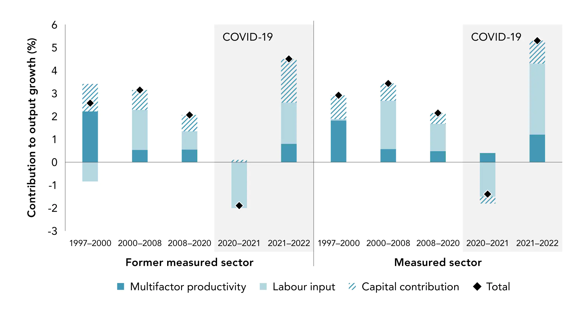
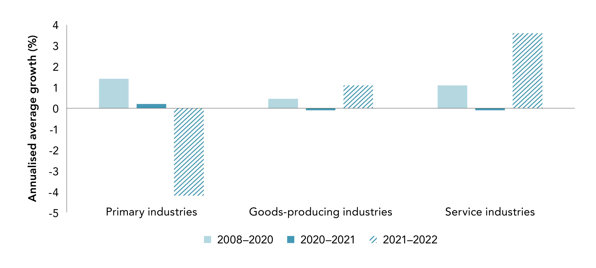
The impact of the COVID-19 pandemic was not like other recessions our economy has experienced. Productivity numbers are unlikely to be similar to other recessions for both economic and measurement reasons. The pandemic introduced a seismic shift to the economy and society, with long-lasting impacts on the way we work, travel, and socialise. Government interventions to minimise the economic damage of the pandemic also had an impact. This has had two major consequences. First, Stats NZ made changes to the way it calculates productivity and its components, for the statistics to be useful in the pandemic context. Second, the usual assumptions about economic behaviour did not hold. In bad times, firms with declining revenues will shrink or fail altogether. This was less likely to happen during the pandemic, due to the availability of subsidies, meaning there are a number of firms still operating that would otherwise have ceased (Bowman, 2022; McGowan et al., 2017; Pelosi et al., 2021).

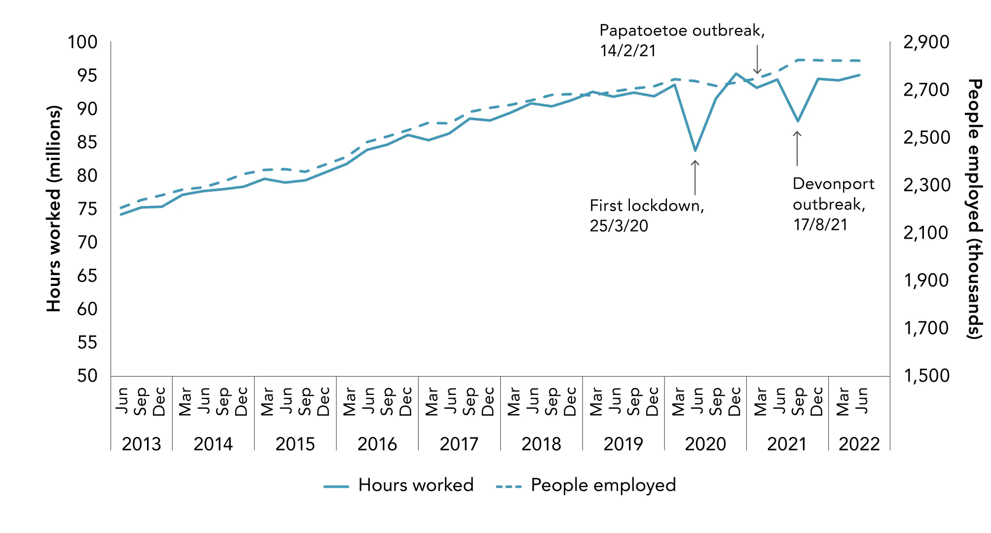
The data in the following charts go up to the year ending March 2022. The COVID-19 pandemic and resulting lockdown have been among the most economically disruptive events in recent history, with Aotearoa New Zealand’s GDP falling by the largest amount on record in the June quarter of 2020, before rebounding dramatically in the following quarter. For labour productivity, the effect of a recession depends on the extent to which firms hold on to staff during a downturn and how much firms suffer declines in output. For example, Myers, (2009) argued that, during a downturn, labour productivity growth “would be expected not to fall as much as output growth in theory because it is the least productive workers that are laid off first and the more productive workers that are retained” (p. 20). Lockdowns had different effects on businesses, depending on whether they were classed as essential services, their location, the extent to which they could continue to operate despite workers being confined to their homes, and the availability of government assistance to maintain employment relationships. As we go on to explain below, the varied effects of lockdowns meant the economic response to COVID-19 was quite different to responses to other economic shocks.

The COVID-19 pandemic had a major influence on the economy

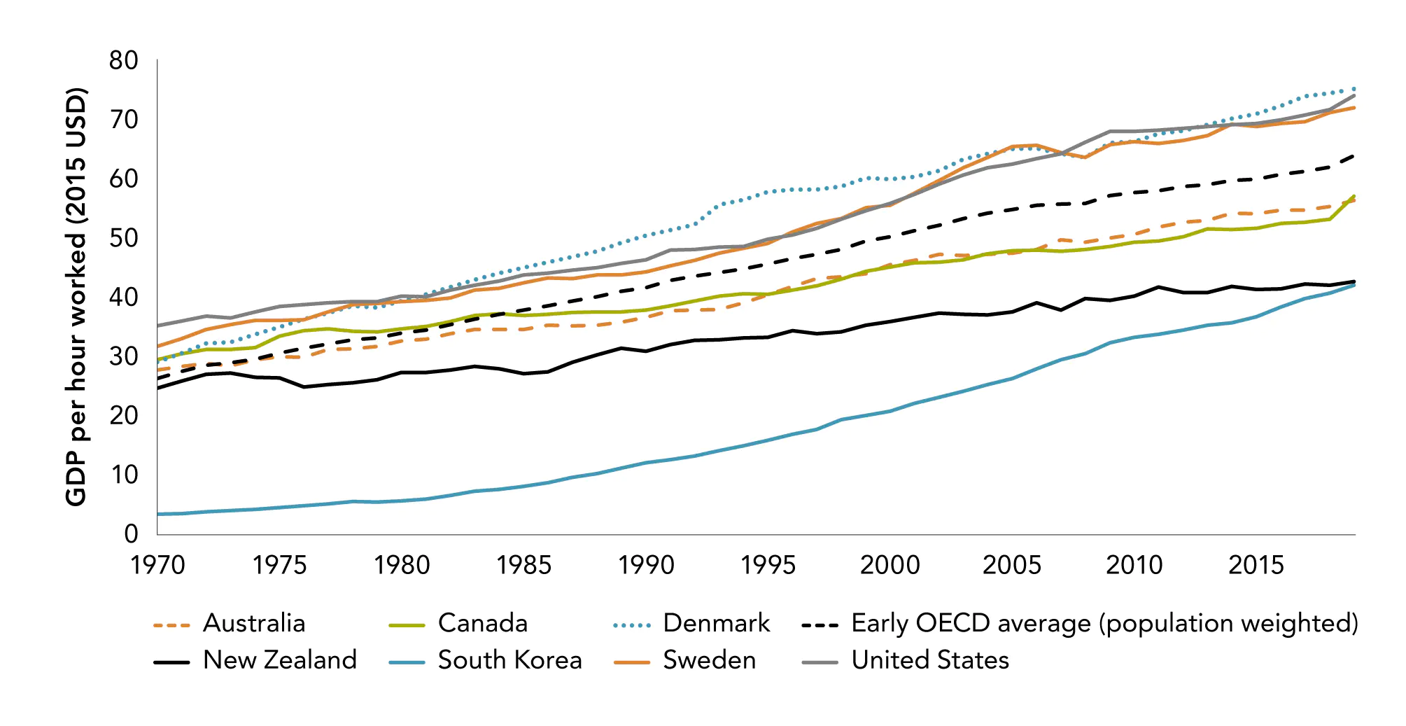
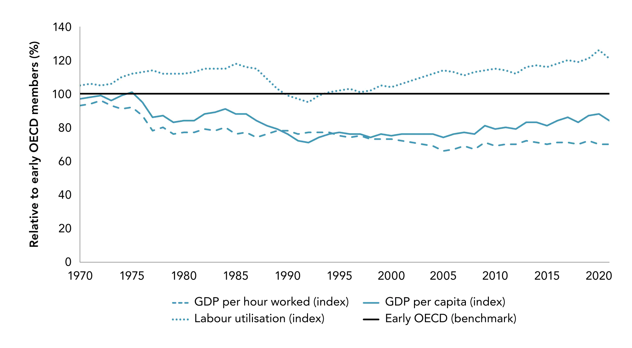
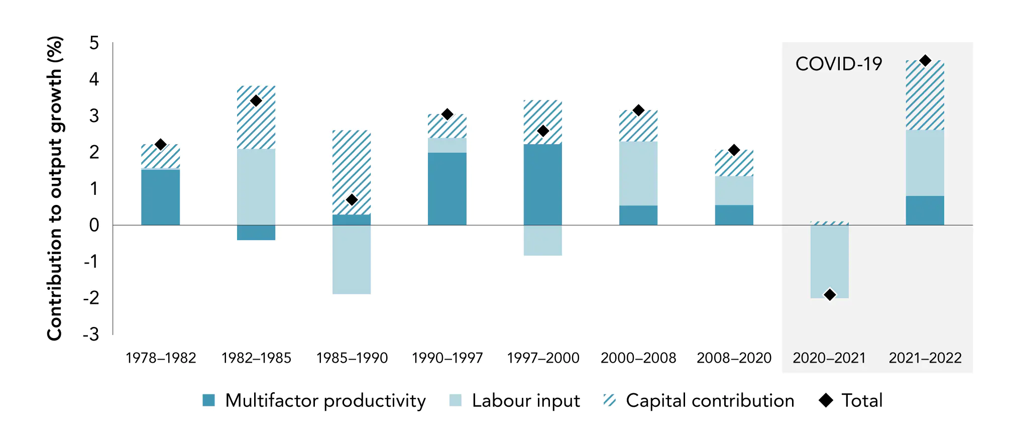
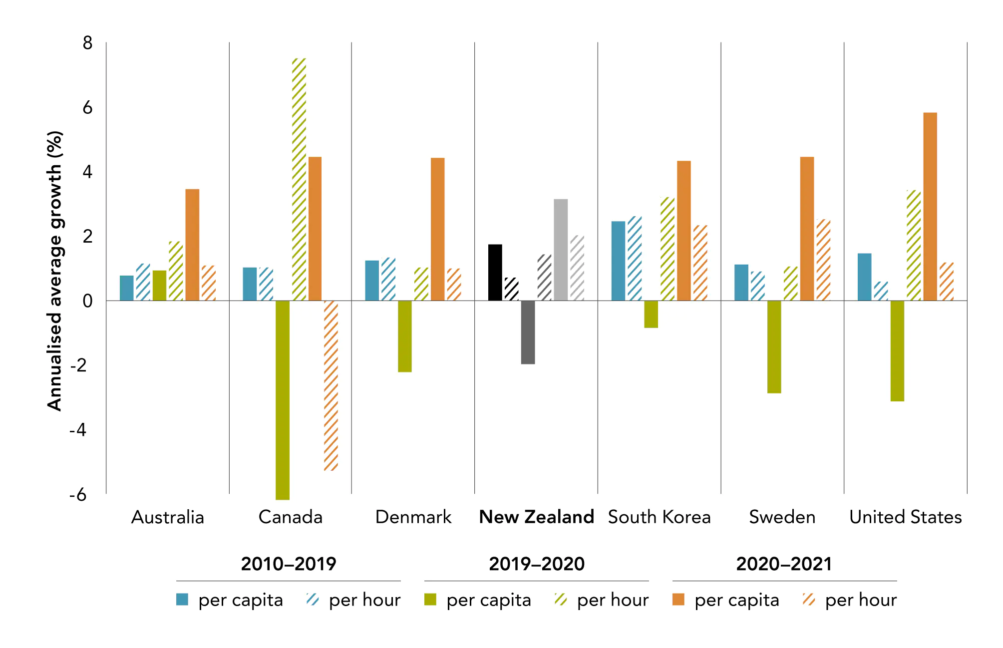
Figure 3.14 compares growth in GDP per capita and GDP per hour worked in Aotearoa New Zealand and other OECD countries. Events in 2020 were unprecedented for the entire world, and output in general was low for almost every OECD country. However, the impact of the pandemic on output per hour worked vs output per capita has been very different. During the lockdown period, labour input decreased, and capital utilisation reduced, leading to a dramatic drop in output per capita. This fall rapidly reversed in 2021, as people and firms returned to work. Both the 2020 decline and the 2021 recovery were relatively muted in New Zealand, perhaps reflecting the shorter duration of the 2020 lockdowns and the provision of government assistance to firms and workers, alongside continuing strict border controls and extended lockdowns (particularly in Auckland).

In contrast, output per hour worked remained strong in 2020, with many countries seeing growth in GDP per hour worked well above the average of the previous decade. Declining output per capita and rising output per hour was a combination of a decrease in total output and an increase in the average capacity of the remaining firms and workers. There are several reasons for this. As already noted, capital will not adjust as fast as labour, so this led to an increase in the effective capital-labour ratio within firms. In addition, as they are reducing labour input, firms will tend to reduce the hours of the least productive staff first wherever possible, increasing the average productivity of staff working. The COVID-19 pandemic experience is also a reminder that we should rely on long-term multi-year trends instead of the productivity figures for a single year.

Figure 3.14 Labour productivity (GDP per capita and GDP per hour worked), 2010–2021

Figure 3.14 Labour productivity GDP per capita and GDP per hour worked 20102021

Source: New Zealand Productivity Commission calculations, based on OECD data.

Figure 3.15 Quarterly hours worked and employment (seasonally adjusted)

Figure 3.15 Quarterly hours worked and employment seasonally adjusted

Source: New Zealand Productivity Commission calculations, based on Stats NZ Household Labour Force Survey data.

Notes:  Hours worked is the total number of hours worked in the economy in the quarter.

Figure 3.15 shows the impact of COVID-19 and subsequent government decisions on labour, with an upward trend in the number of people employed and the hours they worked.27 The first lockdown, which began on 26 March 2020 (with restrictions progressively lifted on 28 April, 13 May, and 8 June), resulted in a large drop in actual hours worked – over 9 million hours. Because of government support, the impact on the number of people employed was negligible. The hours worked bounced back in the following quarter (although not completely, because of a second outbreak in Auckland in August 2020) and returned to trend levels the quarter after that. There is a brief blip in hours worked related to lockdowns after the community outbreak in Papatoetoe on 14 February 2021. The final lockdown in August 2021, arising from cases in Auckland and other parts of the North Island, resulted in a drop of over 6 million hours worked (6.6%).

This faster adjustment of hours worked than people employed is something that is also seen over the business cycle. Firms tend to hold on to staff with hard-to-find or hard-to-acquire skills, even when activity declines, because of difficulties in replacing them when the demand for goods or services increases again. This is known as “labour hoarding”, and it results in total employment being less cyclical than output, and the employment of lower-skilled workers to be more cyclical than that of higher-skilled workers (Bertola & Caballero, 1994; Oi, 1962; Stevens, 2007).

Lockdowns, social distancing, and changes in work habits had very different impacts across industries (Figure 3.16). Declines in both output and labour input were strongest in the services sector, with large parts of this sector affected by reduced social interaction and ongoing travel restrictions. In contrast, primary sector growth remained strong between 2020 and 2021.

Although the availability of foreign staff (such as through the Recognised Seasonal Employer Scheme) dried up due to border restrictions, labour levels were maintained through the use of labour that would otherwise have been employed elsewhere (for example, in the hospitality sector), or through increased hours of work for existing staff (Maré et al., forthcoming; NZPC, 2022a). With input and output growth affected similarly, labour productivity remained at roughly the same level as in 2019–2020 (Figure 3.17).

Figure 3.16 Output and labour input growth, 2008–2022

Figure 3.16 Output and labour input growth 20082022

Source: New Zealand Productivity Commission calculations, based on Stats NZ Productivity statistics: 1978–2022 (Stats NZ, 2023).

Notes: Growth rates are annualised average growth calculated from index.

Values for 2021–2022 are based on provisional estimates.

Figure 3.17 Labour productivity, 2008–2022

Figure 3.17 Labour productivity 20082022

Source: New Zealand Productivity Commission calculations, based on Stats NZ Productivity statistics: 1978–2022 (Stats NZ, 2023).

Notes: Growth rates are annualised average growth calculated from index.

Values for 2021–2022 are based on provisional estimates.

This variation in outcomes is even clearer at the narrower industry level (Figure 3.18). Sectors such as Accommodation and Food Services, and Transport, Postal and Warehousing Services saw the most dramatic falls in labour input, with year-on-year declines of over 10% in hours worked. In Accommodation and Food Services, this related to a reduction in activity as people stopped going to the restaurants and cafes due to social distancing and home isolations, overseas tourists were unable to enter Aotearoa New Zealand, and businesses faced severe restrictions on the numbers of people who could be on the premises. However, as output declines were less pronounced than the decline in labour input, labour productivity growth in the industry was high. At the other end of the spectrum, some industries, and key services – including Healthcare and Social Assistance Services; Electricity, Gas, Water and Waste Services; and Financial and Insurance Services – saw an increase in labour inputs, with low or negative growth in labour productivity.

Figure 3.18 Labour productivity and hours worked during the COVID-19 pandemic

Figure 3.18 Labour productivity and hours worked during the COVID 19 pandemic

Source: New Zealand Productivity Commission calculations, based on Stats NZ Productivity statistics: 1978–2022 (Stats NZ, 2023).

The pandemic forced many firms to reassess their working processes and invest in technology. The most obvious manifestation of this has been the dramatic rise of video conferencing as an essential work tool, but there are many other examples (for example., the expansion of many “brick-and-mortar” retailers to online sales). Sectors such as Technical and Scientific Services remained robust during the turmoil due to the ease of working from home provisions.28 While the Information Media and Telecommunications sector saw a similar decline in labour inputs to the preceding two years, output from the industry increased strongly, resulting in a large rise in labour productivity.

16 For more discussion on the productivity slowdown, see the previous edition of Productivity by the numbers (NZPC, 2021b).

17 For more on Aotearoa New Zealand’s historical productivity story, see Part 3 of the previous edition of Productivity by the numbers (NZPC, 2021b).

18 Data on hours worked are not available back this far, so we focus on output per head of This provides a good indication of potential income per person, but obscures differences in hours worked – for example, due to cultural differences such as the extent to which women work outside the home.

19 As the economy has evolved and their methods for measuring inputs and outputs in more sectors have evolved, Stats NZ has expanded the number of industries in its productivity statistics. However, these extended series only go back as far as 1997. To decompose productivity into its components back further, we focus on the former measured sector – which goes back to 1978 but excludes some services sectors like rental and real estate For more details on the industries in the former measured sector, see notes to Figure 3.8 and see footnotes 12 and 20.

20 The current measured sector is defined as ANZSIC06 published industries AA1–AA3, BB1, CC1–CC9, DD1, EE1, FF1, GH1, GH2, II1, JJ1, KK1, LL1, MN1, MN2, RS1, and The industries that have been added – as compared to the former measured sector – are LL1 (Rental, Hiring and Real Estate Services), MN1 (Professional, Scientific, and Technical Services), MN2 (Administrative and Support Services) and RS2 (Other Services). This data is only available from 1996.

21 For more on this, see Box 7 on page 25 of the previous edition of Productivity by the numbers (NZPC, 2021).

22 We cover the periods during and after COVID-19 separately in section 4.

23 See (Simpson, 2009) for a useful overview.

24 For an early discussion of the methods used to calculate productivity statistics in education and healthcare by Stats NZ, see (Tipper, 2013).

25 “Often the private sector cannot be relied upon to produce these outputs efficiently and/or equitably. But the very reason why these services are provided by the public sector makes their management and the assessment of their performance problematic” (Stevens, 2006).

26 See, for example, Castelli et (2007) and Gemmell et al. (2018).

27 These figures are seasonally adjusted to identify changes more clearly.

28 According to data from (Stats NZ, 2020), the sectors in which people are most likely to work from home are Financial and Insurance Services (71%), Information, Media and Telecommunications (66%), and Technical and Scientific Services (59%).